Brand Identity
These Nights
Industry: Travel
Scope: Brand Identity, Social Templates, OOH, & Landing Page
Role: Art Direction (with Creative Director), Design, & Content Development
Creative Director: Peter Sather
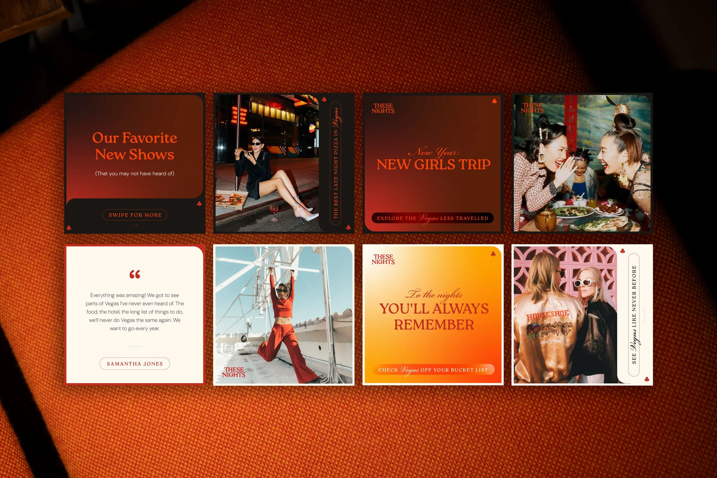
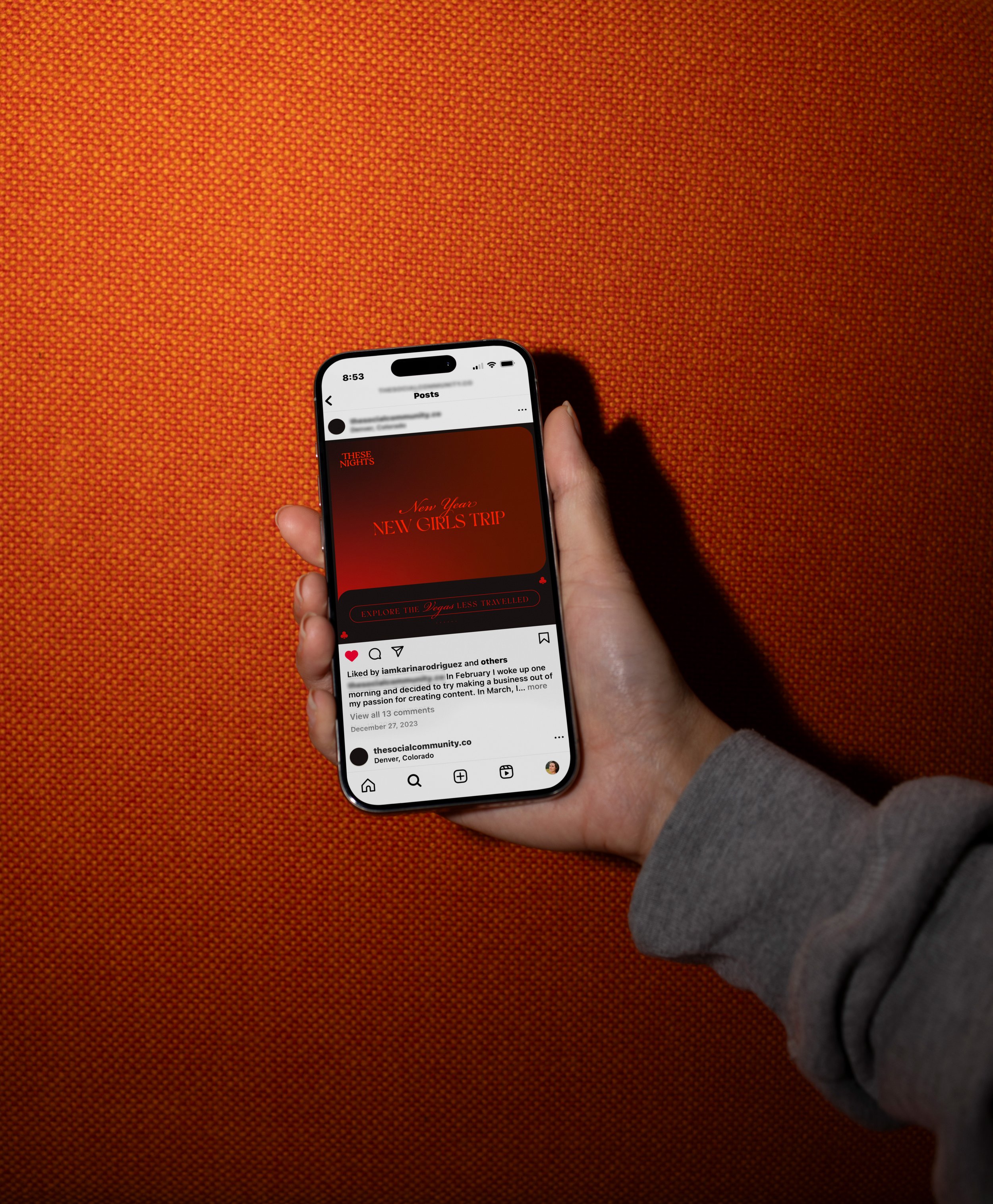
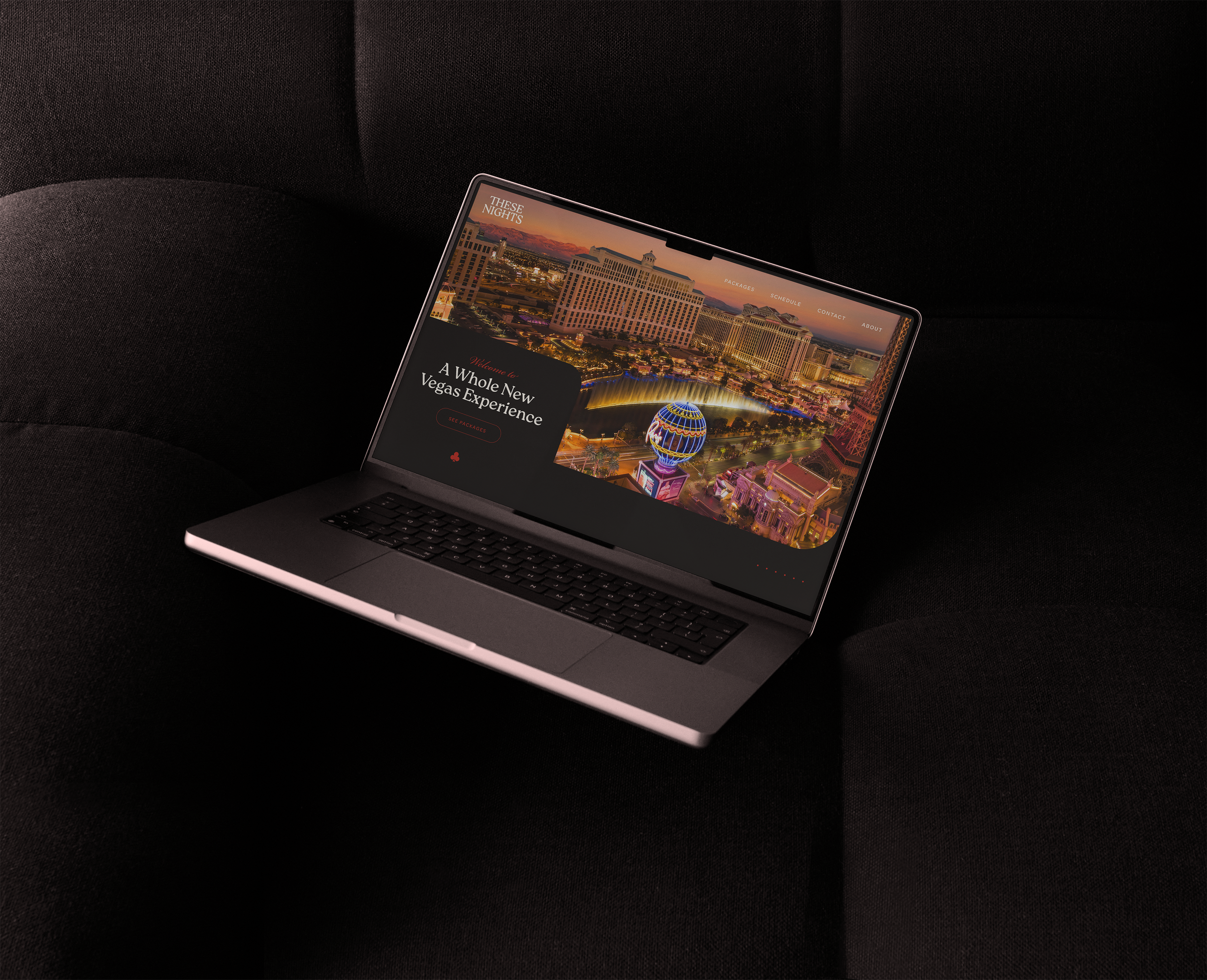
A brand identity pitch for a Las Vegas group travel company catering to people who want something more than the standard Vegas weekend.
These Nights is for the traveler who's been to Vegas and wants to go back for completely different reasons. They curate group experiences built around the city's quieter magic, the kind that doesn't show up on a party package itinerary. The pitch explored a visual direction that could hold that distinction without abandoning what makes Vegas feel like Vegas.
-
Vegas has a very loud visual identity, and most brands in the space lean straight into it. These Nights was built for a different kind of traveler, one who wants the magic of the city without the chaos. The challenge was creating something that felt unmistakably Vegas without defaulting to neon maximalism or generic luxury.
-
The identity leans into glow over flash. A red light gradient channels the warmth of a neon sign seen from a distance, cinematic and atmospheric rather than loud. Even the logo does some storytelling: the H's connect with the letters around them, a quiet nod to the idea that the best travel experiences are defined by who you're with. Vintage-inflected typography and a restrained layout round out a brand that feels like a local's recommendation, not a tourist trap. The kind of Vegas that rewards people who know where to look.
-
The concept wasn't selected, but the creative direction pushed somewhere genuinely interesting. When the brief is a city everyone thinks they already know, finding a visual angle that feels fresh is its own kind of win.