Brand Identity
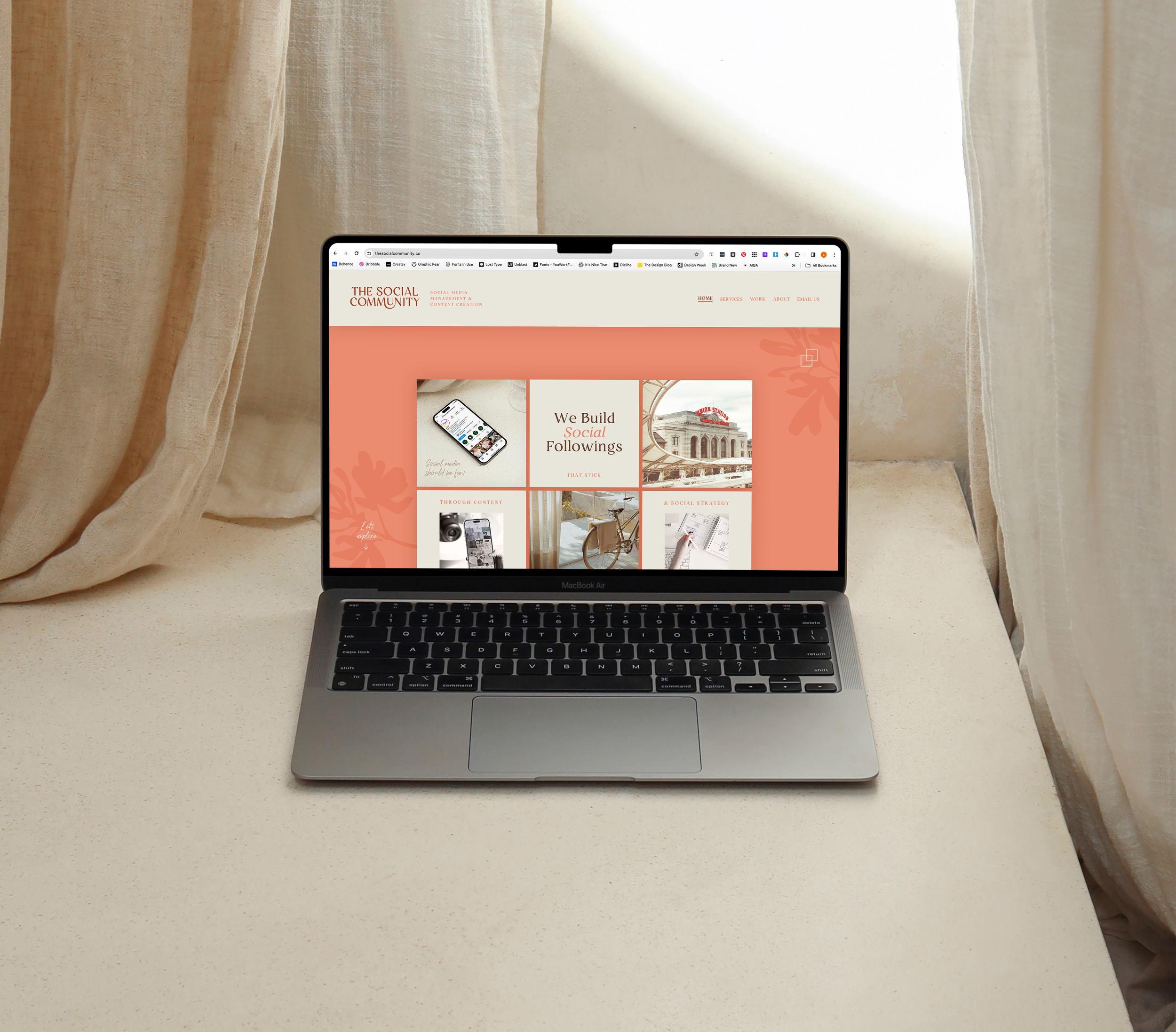
The Social Community
Industry: Social Media & Content Creation
Scope: Brand Identity, Landing Page, Social Templates, Letterhead, & SWAG
Role: Creative Direction, Creative Strategy, Design, & Copywriting
A net-new identity for a social media management company, designed to feel refined and relationship-driven in a space that tends toward loud, generic, and trend-driven.
The Social Community takes a more intentional, human approach to social media management and needed a brand that communicated that distinction. Full creative direction, strategy, design, and copywriting from the ground up.
-
The social media industry is crowded with brands that skew bold, bright, and trend-driven. The Social Community needed an identity that set them apart by feeling considered and human, appealing to clients who wanted a real strategic partner rather than just content output.
-
The identity expresses connection through form. Interlocking letterforms in the logo represent the relationships at the core of the brand's approach, creating a mark that feels dynamic without being loud. A restrained neutral palette aligns with the aesthetic language of modern creators, while a modern serif typeface and hand-drawn floral details introduce warmth and individuality. The result is a brand that feels personal without being precious, refined enough to attract discerning clients and approachable enough to feel like a partnership.
-
The client's immediate and enthusiastic response was a strong signal that the identity captured something true about how they work and who they work for. A brand that finally felt like them.