Brand System & Website
Project Canary
Industry: Clean Technology
Scope: Brand System (using existing logo), Website, Presentation Decks, Brochures, Social Templates, One-Sheeters, Product Design, & Event Materials
Role: Art Direction (with Creative Director), Design, & Content Development
Agency: Suprema
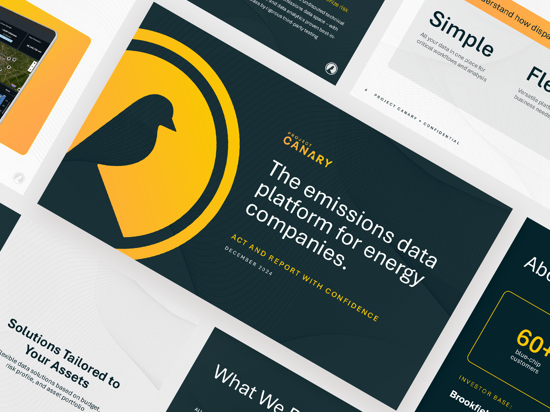
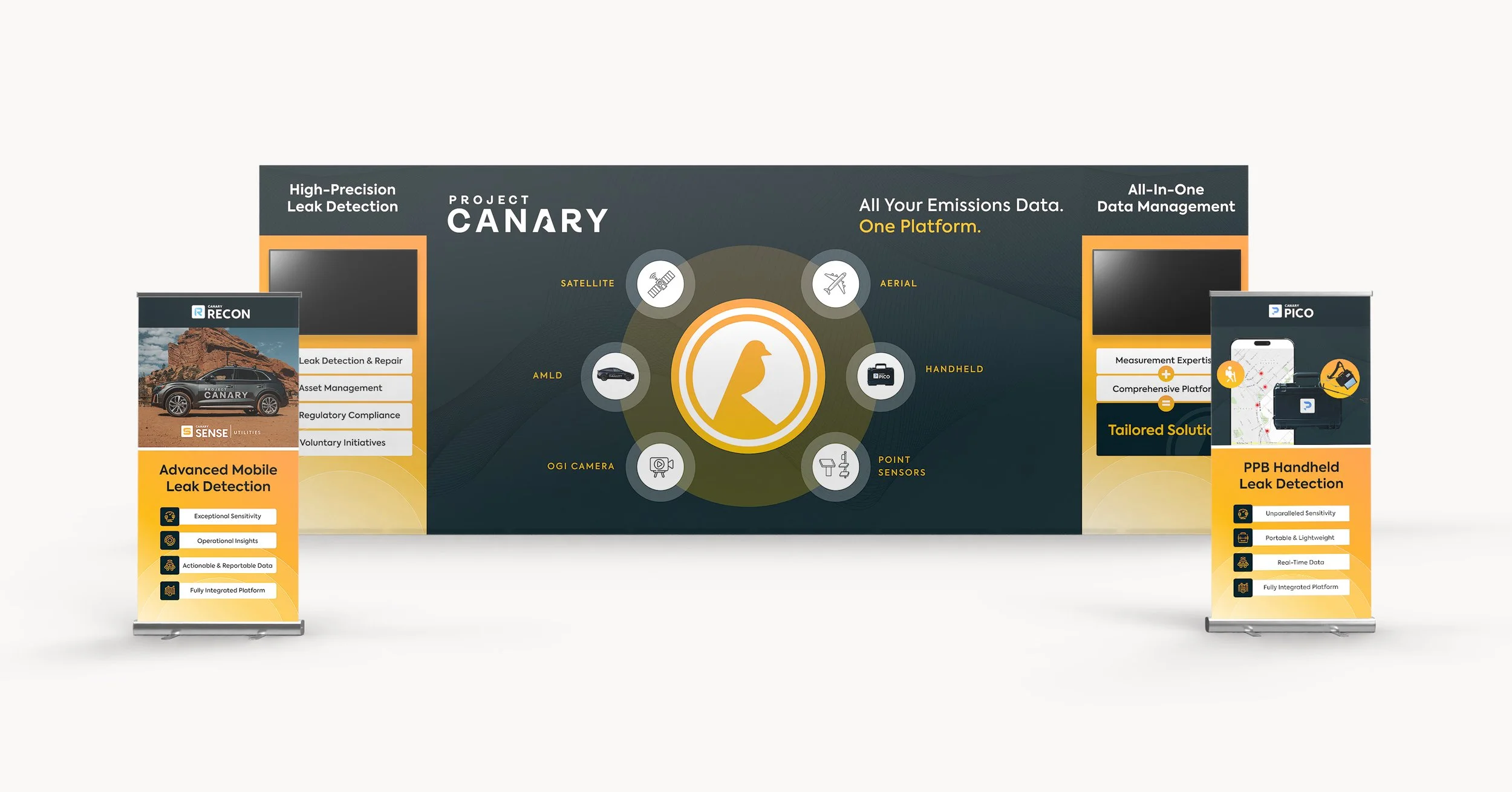
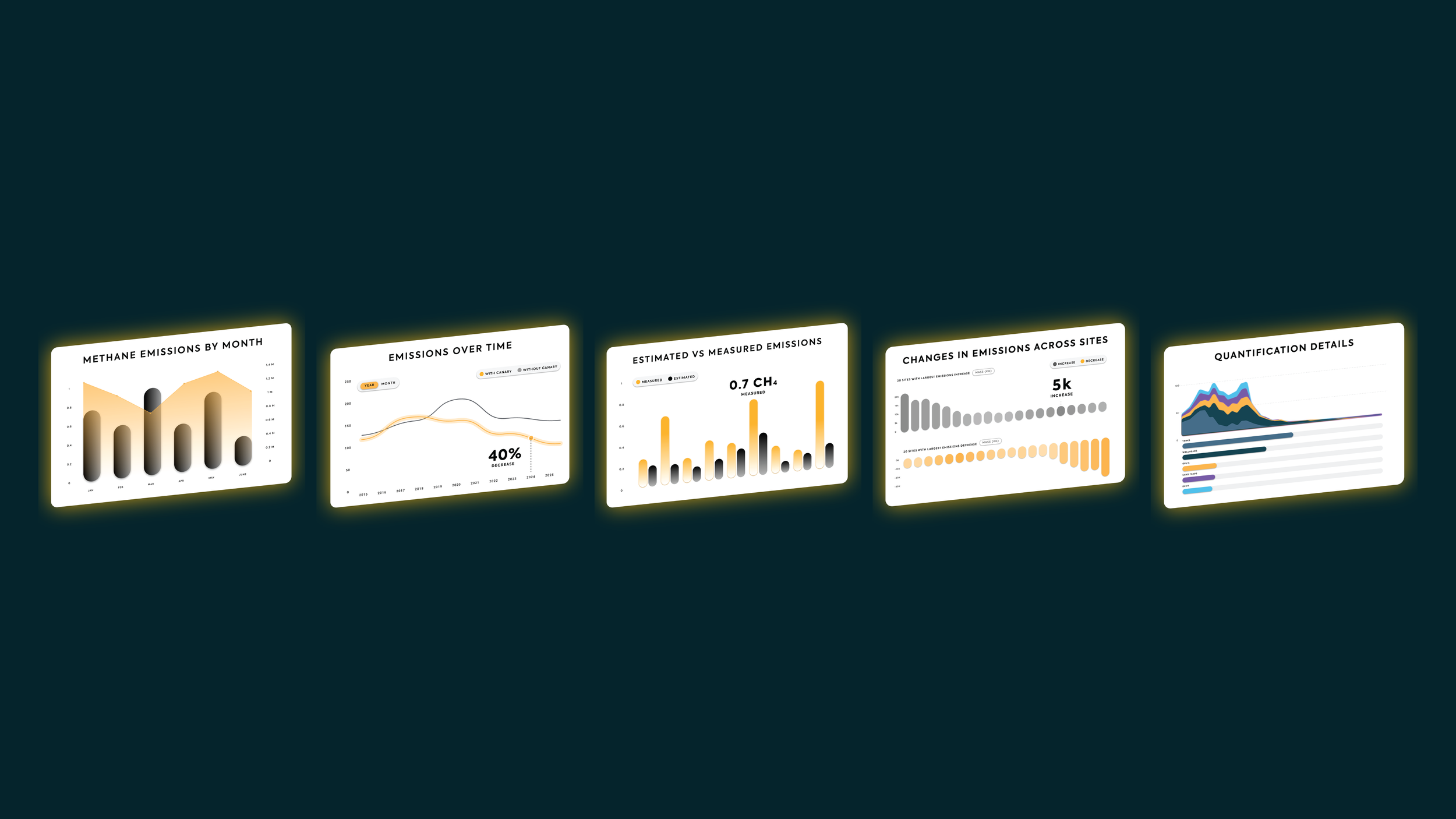
A brand system built for a clean tech company navigating a strategic pivot, designed to communicate data and precision without leaning on green energy clichés.
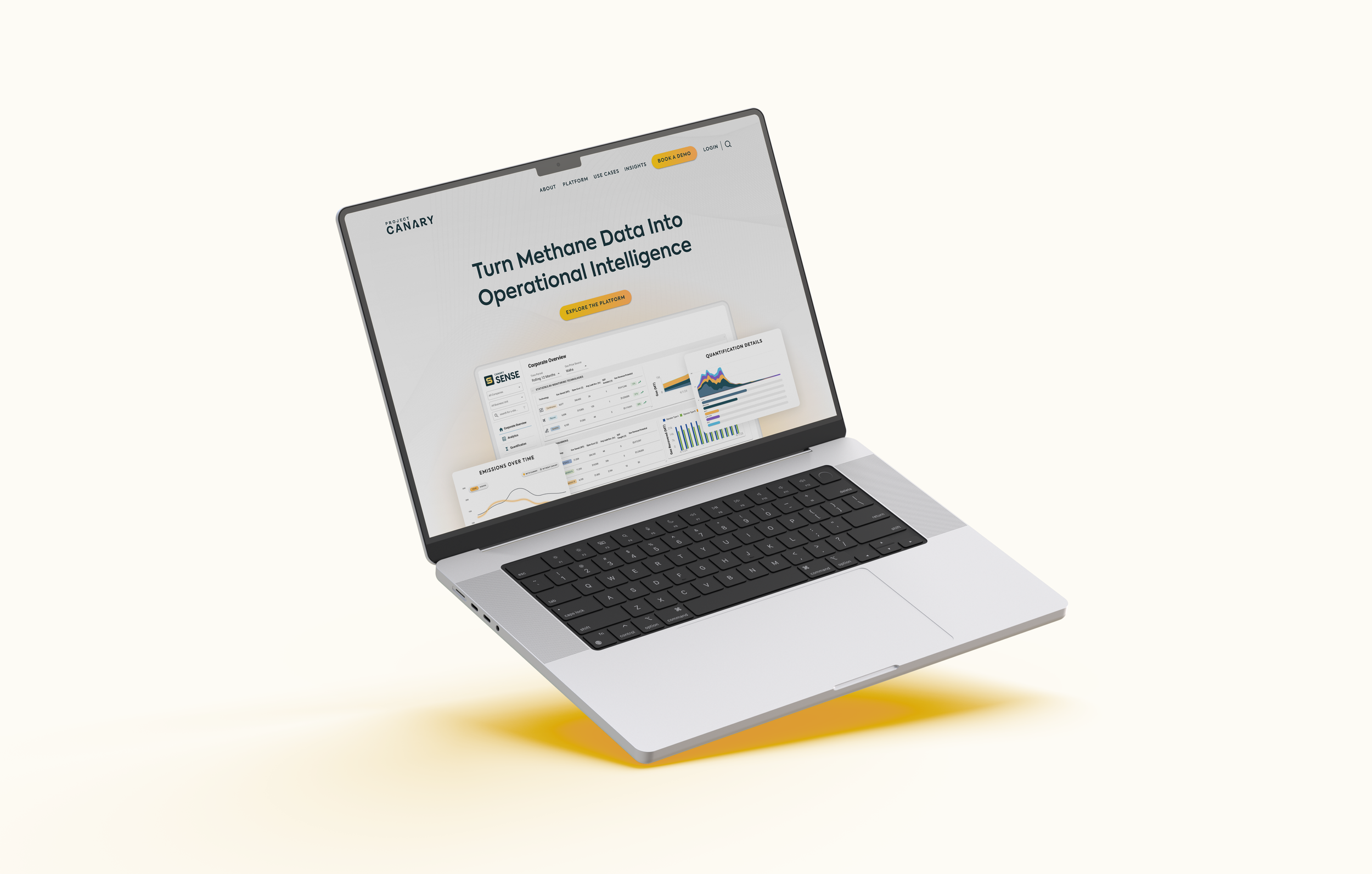
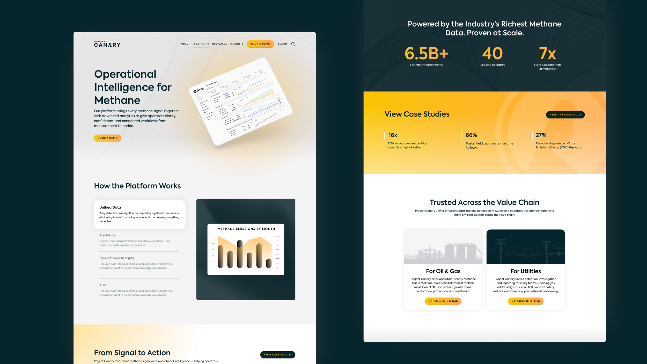
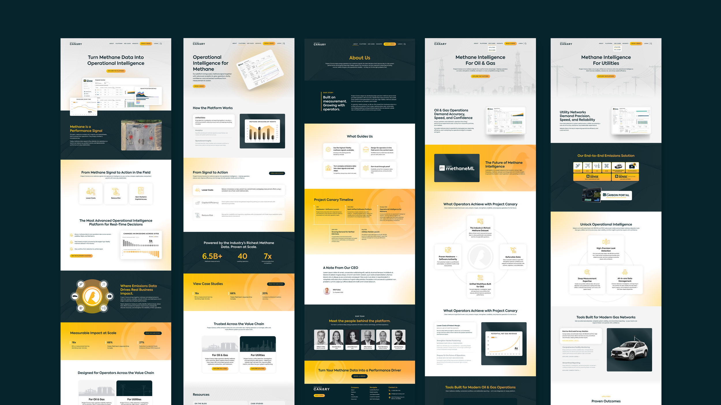
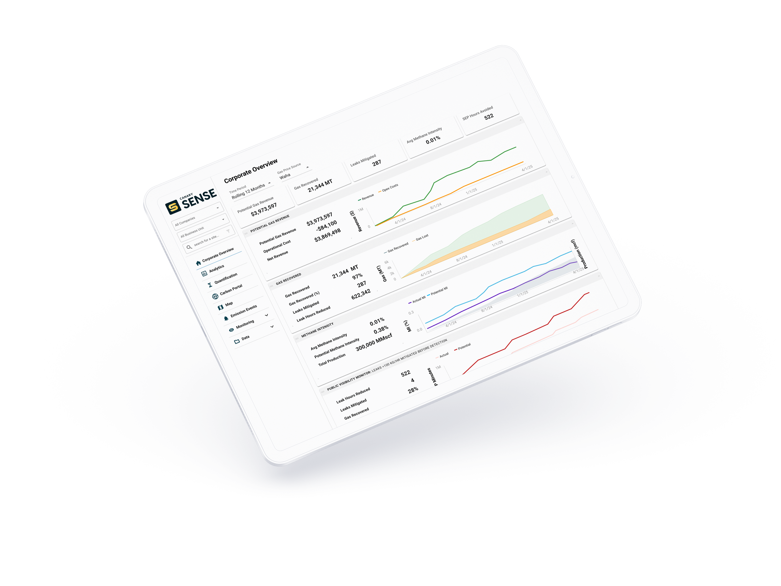
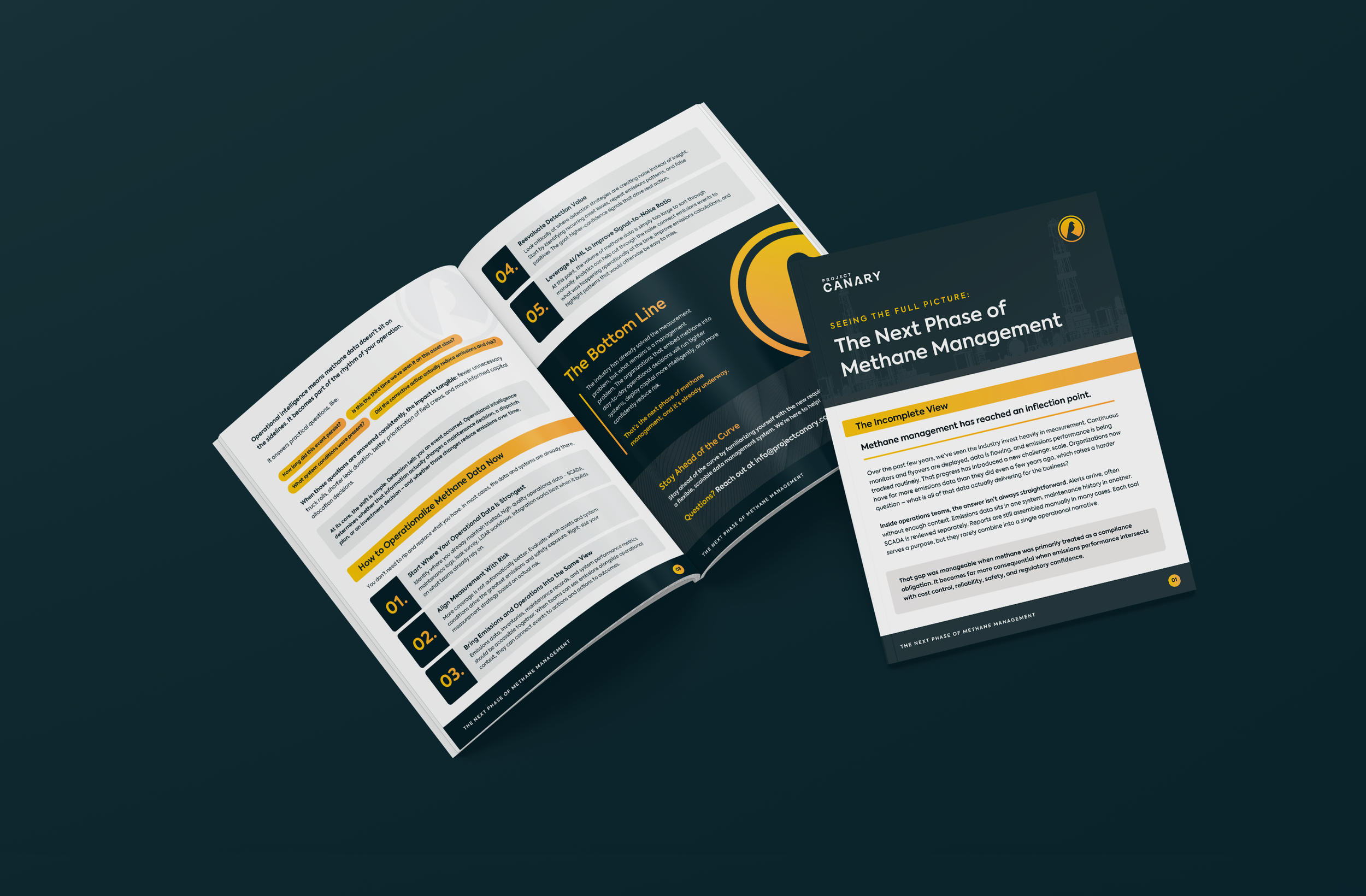
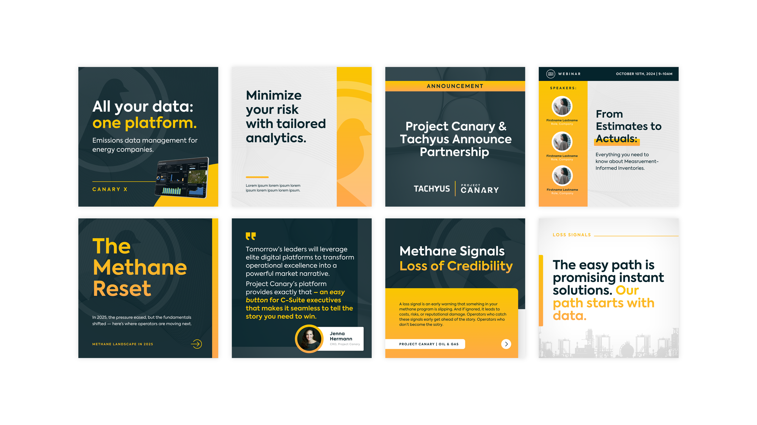
This project extended an existing logo and signature yellow into a cohesive, scalable system across web, product, marketing, and events. The work focused on positioning Project Canary through a lens of operational intelligence rather than environmental messaging, building a visual language that could grow with the company's new direction.
-
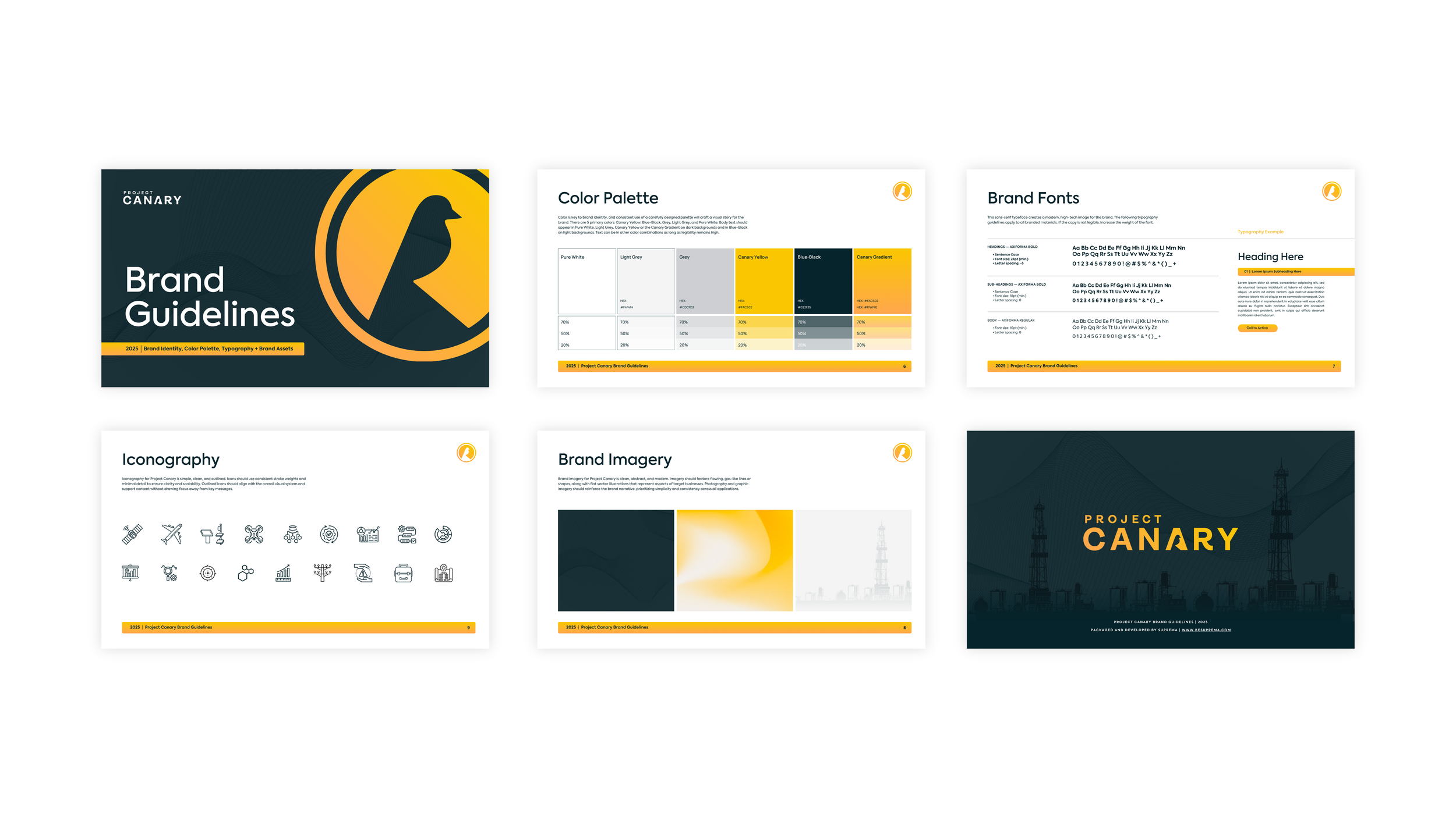
Project Canary was navigating a strategic pivot and needed a brand that reflected their new direction without abandoning existing recognition. The old identity no longer fit the sophistication of their platform, and the typical clean energy visual language of greens, leaf imagery, and industrial smokestacks didn't reflect what they actually do. With a customer base primarily in oil and gas, the brand needed to feel like a tool for operational excellence, not an indictment of the industry it served.
-
Rather than a full rebrand, the work extended and elevated what existed. The existing logo and signature yellow were kept intact, with the yellow expanded into a dynamic gradient system communicating data flow and energy without relying on environmental clichés. A modular design system built across dashboards, marketing, decks, and events gave every touchpoint a shared visual logic, positioning Project Canary through a lens of precision and intelligence rather than environmental messaging.
-
The existing logo and signature yellow were non-negotiable. The work had to build a cohesive, elevated system from those starting points without a full rebrand, and needed to avoid photography-heavy executions given limited asset availability.
-
The client moved into their next phase with a cohesive system that reflected both new direction and product maturity. The rebrand landed at the right moment, supporting Project Canary's pivot from hardware-focused methane sensing toward a full operational intelligence platform, giving them a visual identity that could credibly carry that story into new markets.