Brand Identity
Magnum Forge
Industry: Energy Technology
Scope: Brand Identity, Letterhead, Email Signatures, Brochures, One-Sheeters, & Event Materials
Role: Art Direction (with Creative Director), Design, & Content Development
Agency: Suprema
A brand refresh for an upstream oil and gas consulting firm, built to match the credibility and expertise of a company that had quietly outgrown its original identity.
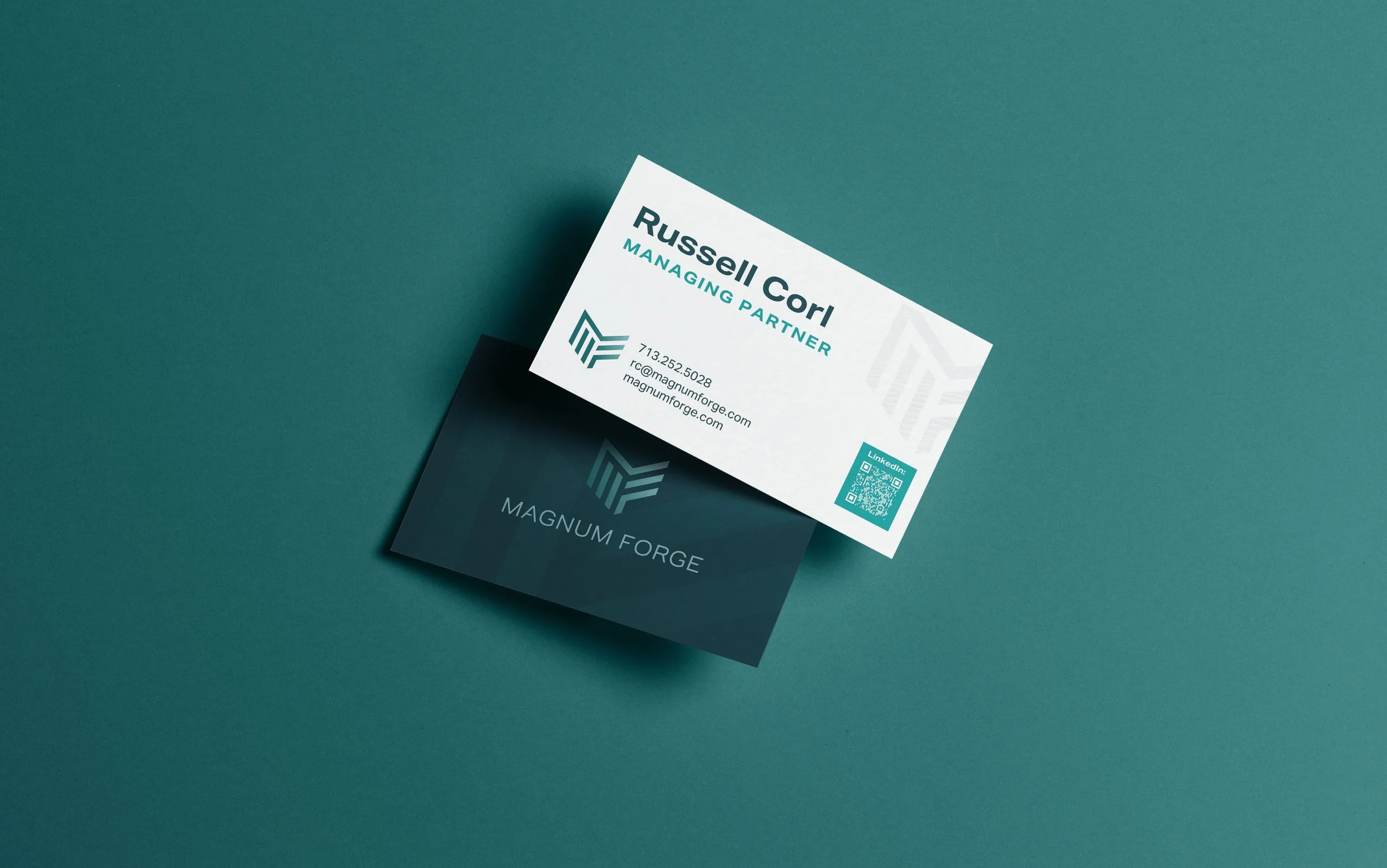
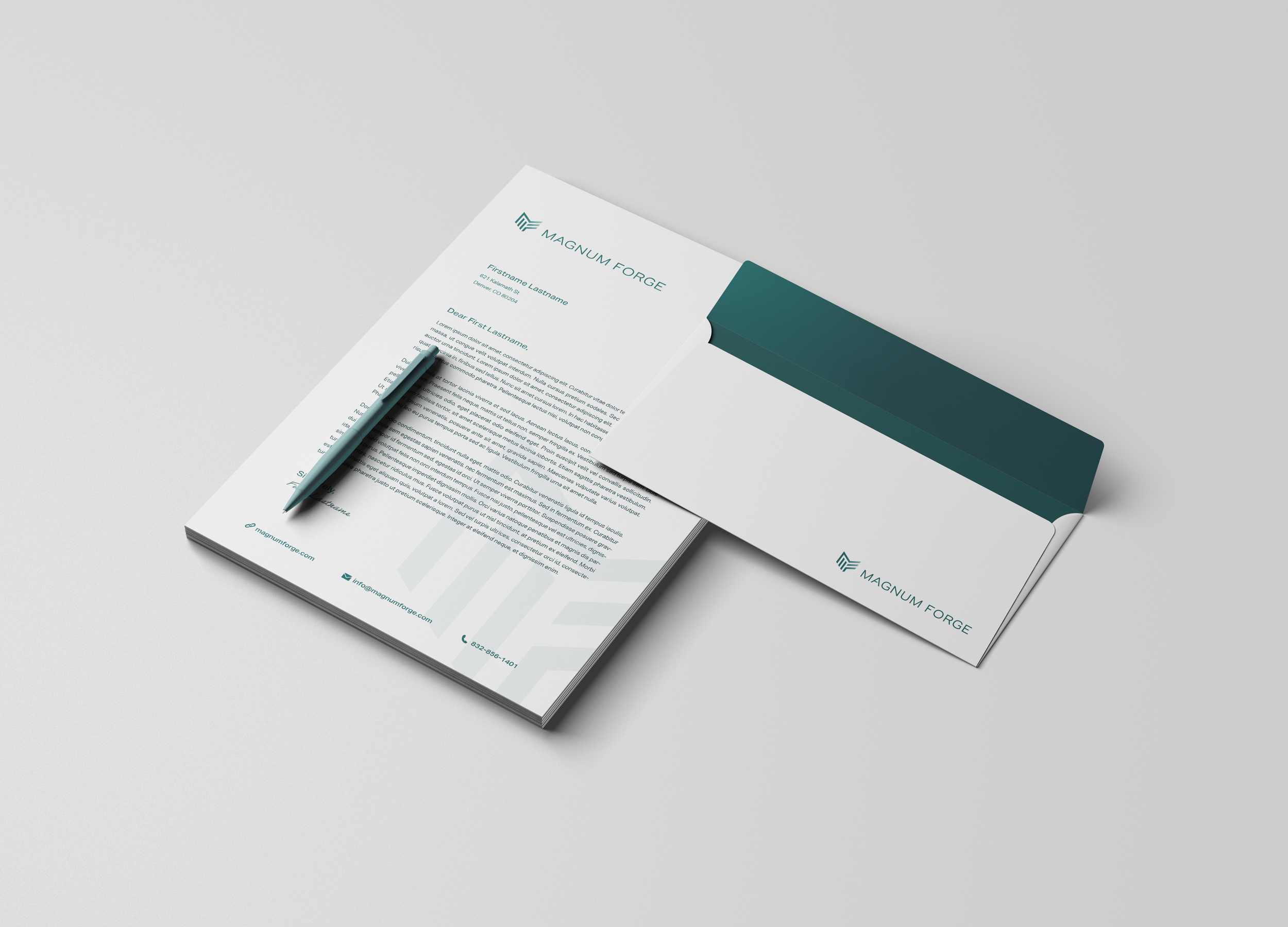
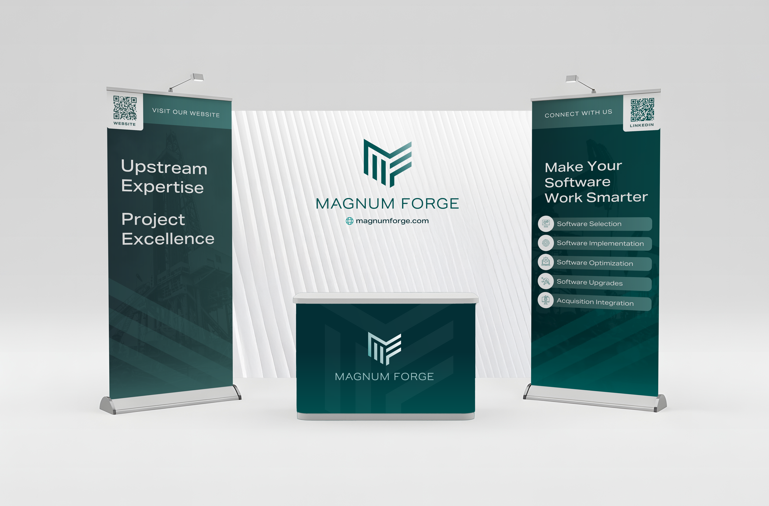
Magnum Forge has been a recognized leader in upstream E&P software consulting since 2008, working with operators across IT, Accounting, Land, and Production systems on everything from software selection to full-scale acquisition integrations. The existing brand no longer reflected that standing. Art direction, design, and content development through Suprema, covering identity, letterhead, email signatures, brochures, one-sheeters, and event materials.
-
The old brand was working against the company. For a firm that competes on expertise and credibility with major E&P operators, looking dated and underdeveloped in client-facing materials was a real liability. The goal was to build something that could hold its own in boardrooms and procurement conversations without losing the approachable, people-first culture that makes Magnum Forge different from larger consultancies.
-
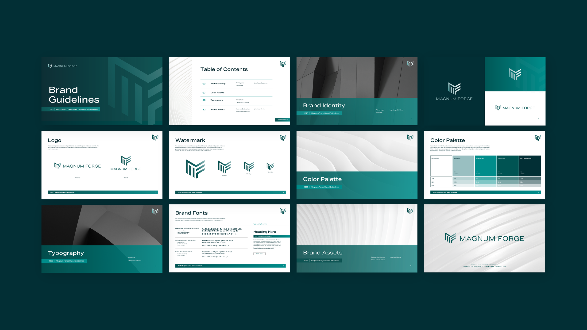
The identity leans into the weight and precision the name already carries. A dark, refined palette communicates seriousness without tipping into cold or corporate, while the mark integrates an MF monogram into a bold, geometric icon built for versatility across print, digital, and event applications. The system gives every touchpoint a shared visual logic, from letterhead to one-sheeters, so the brand shows up consistently whether the audience is a C-suite client or a conference attendee.
-
The rebrand gave Magnum Forge a visual identity that finally matched the caliber of their work, a complete system they could deploy across client engagements, business development, and events with confidence.