Brand System & Website
Intterra
Industry: Public Safety Technology
Scope: Brand System (using existing logo) & Website
Role: Creative Direction, Creative Strategy, Design, & Content Development
Agency: Suprema
A brand refresh for a public safety technology platform, repositioned from an approachable consumer feel toward the authority and precision their product demands.
Intterra's platform helps emergency response teams make critical decisions in real time, but the brand wasn't communicating that weight. New leadership brought the mandate to fix it, and with the creative director out, this project was led independently from direction through delivery.
-
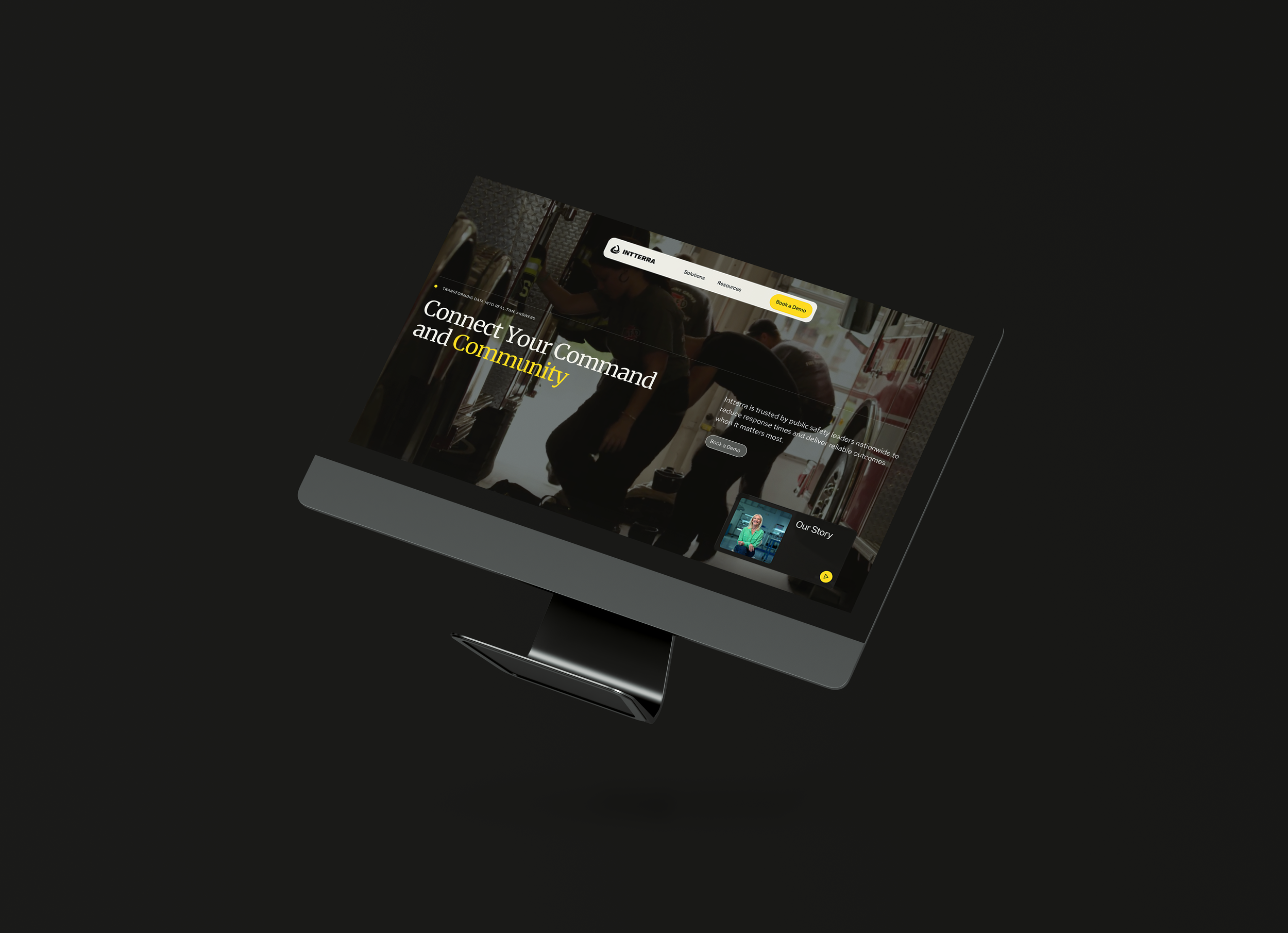
Intterra had a product maturity problem on the outside. The existing brand carried an overly friendly, consumer-facing tone that didn't reflect the seriousness of what the platform actually does: help emergency responders make high-stakes decisions in real time. New leadership wanted a brand that finally matched the sophistication of the product and communicated credibility to the enterprise clients they needed to win.
-
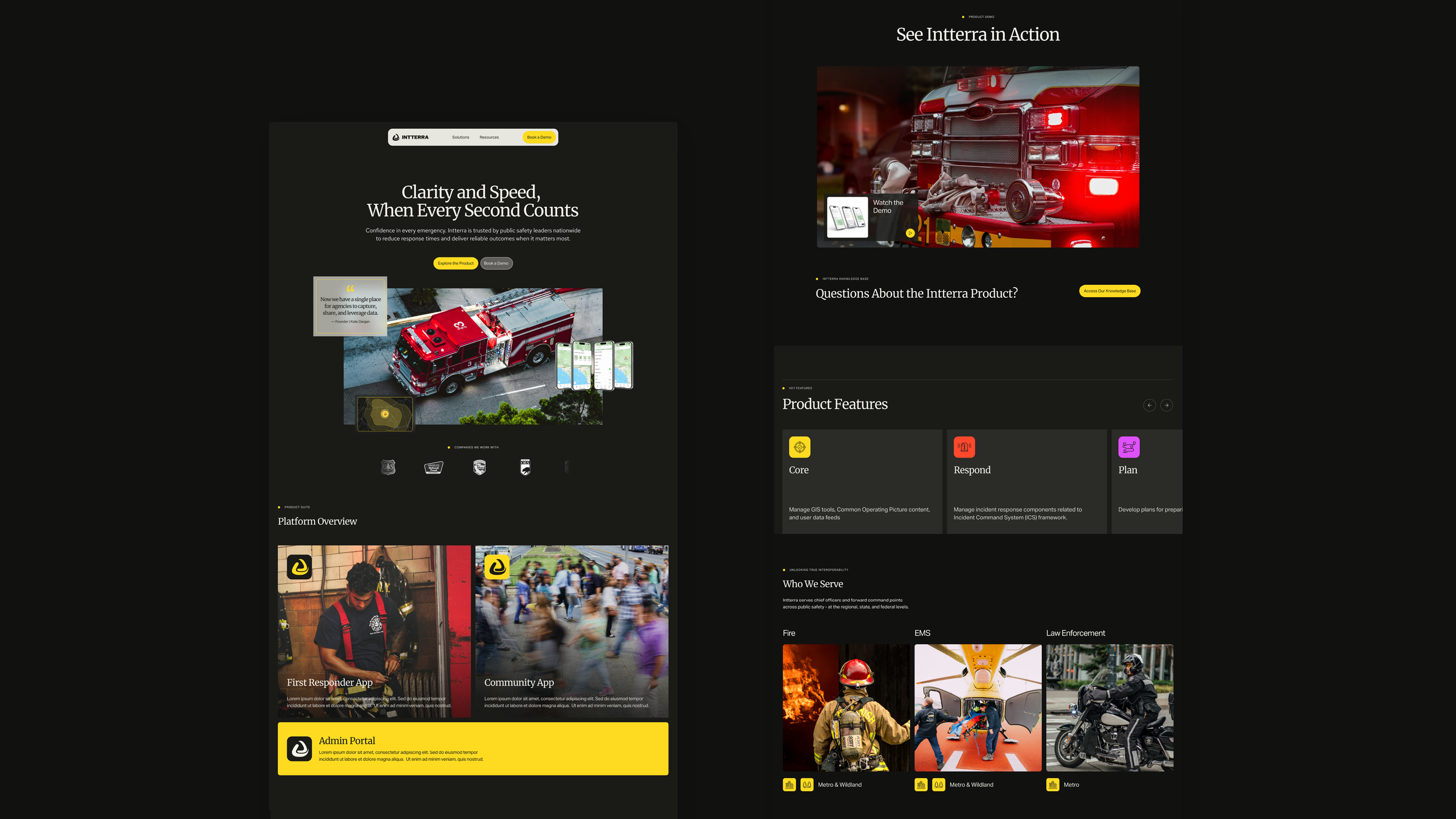
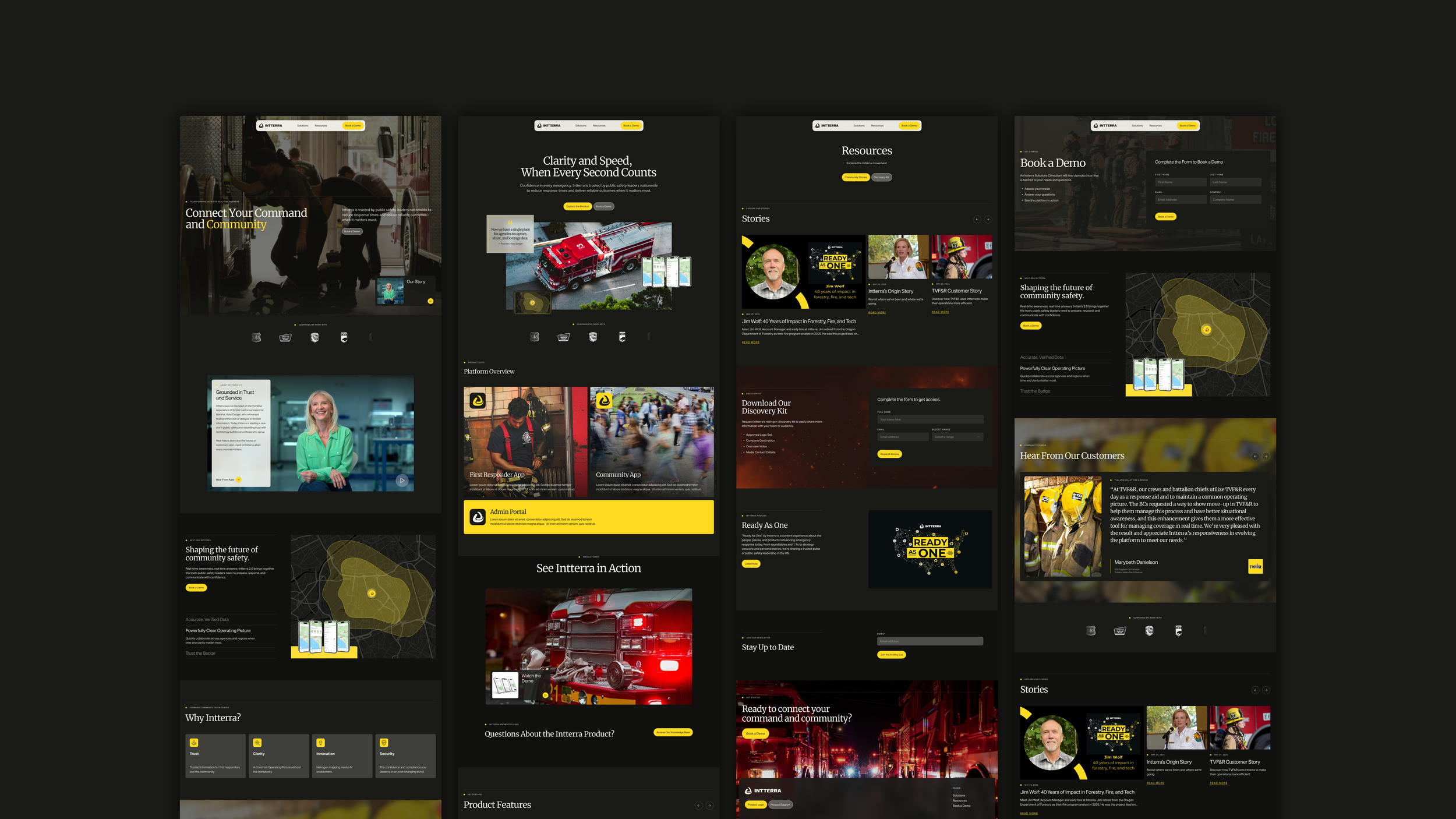
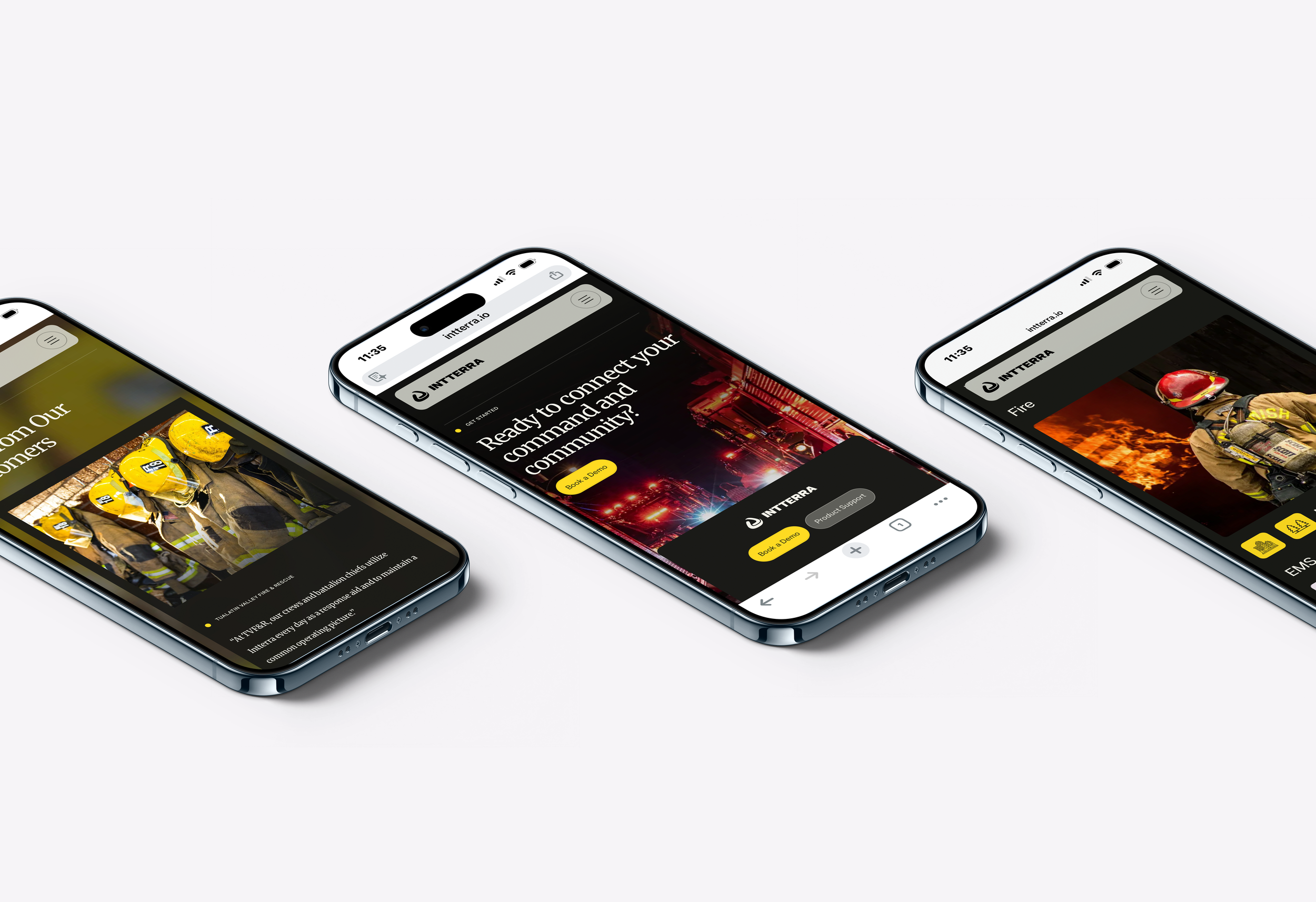
The refresh kept the existing logo intact and treated the signature yellow as a signal color, guiding attention to critical moments the way live data highlights what matters. Darker tones provided the contrast and stability a high-stakes product demands, moving the brand firmly away from anything that felt casual or approachable for the wrong reasons. UI-influenced components and geospatial-inspired layouts made the brand feel native to the operational world it lives in, built to work across both marketing and product environments.
-
The existing logo and signature yellow were non-negotiable. Rather than replace them, the yellow was repurposed as a signal color, used intentionally to draw attention to critical information the way live data highlights what matters. Everything else was rebuilt around it.
-
The site launched to strong client reception, described as finally reflecting the platform's value and fully aligned with new leadership's vision. The brand could now clearly communicate credibility to the enterprise clients Intterra needed to win.