Brand Identity
Collaborative Foster Care
Industry: Foster Care
Scope: Brand Identity, Business Cards, Event Materials, and OOH.
Role: Art Direction (with Creative Director), Creative Strategy, Design, & Content Development
Agency: Groundwrk
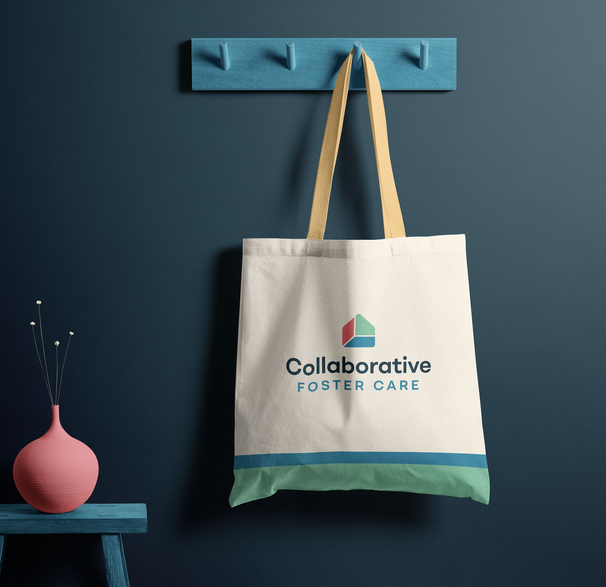
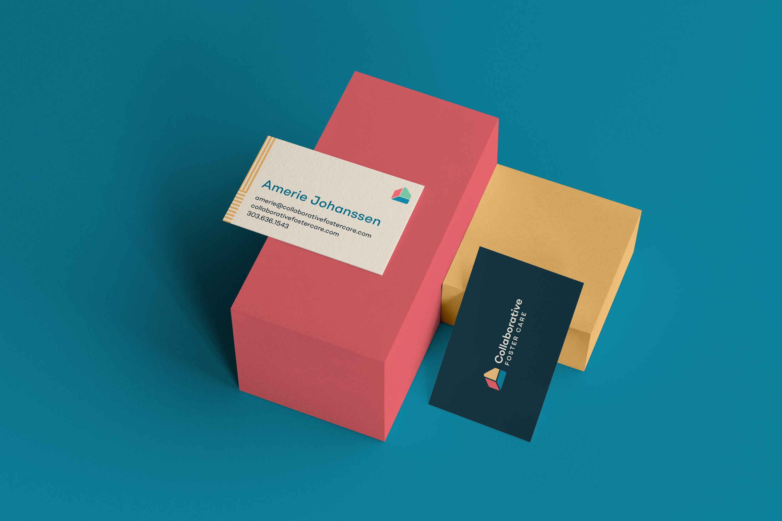
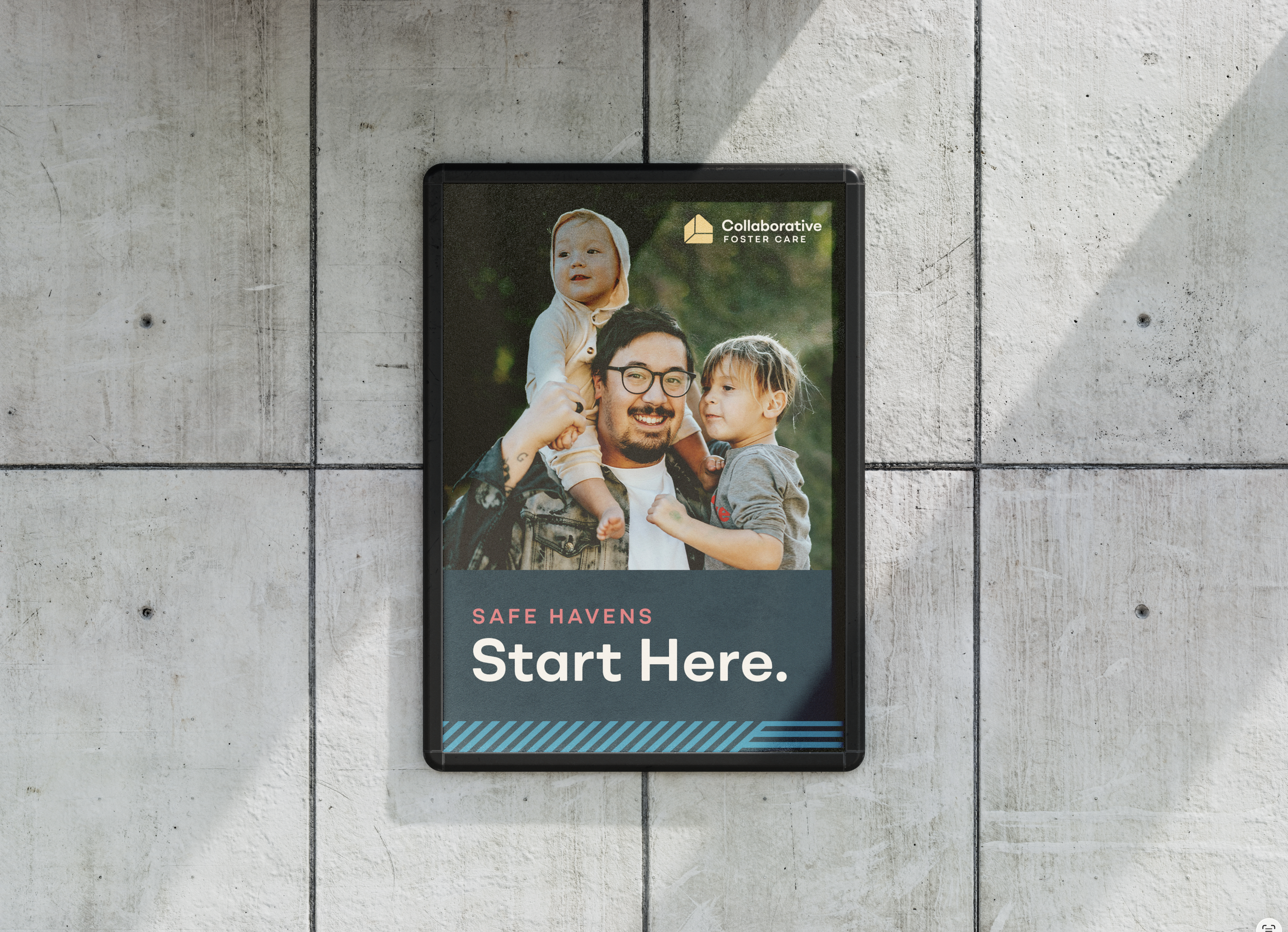
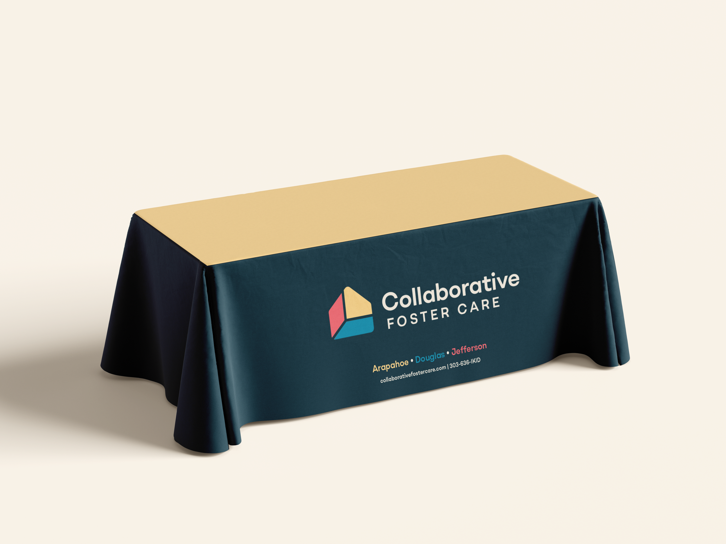
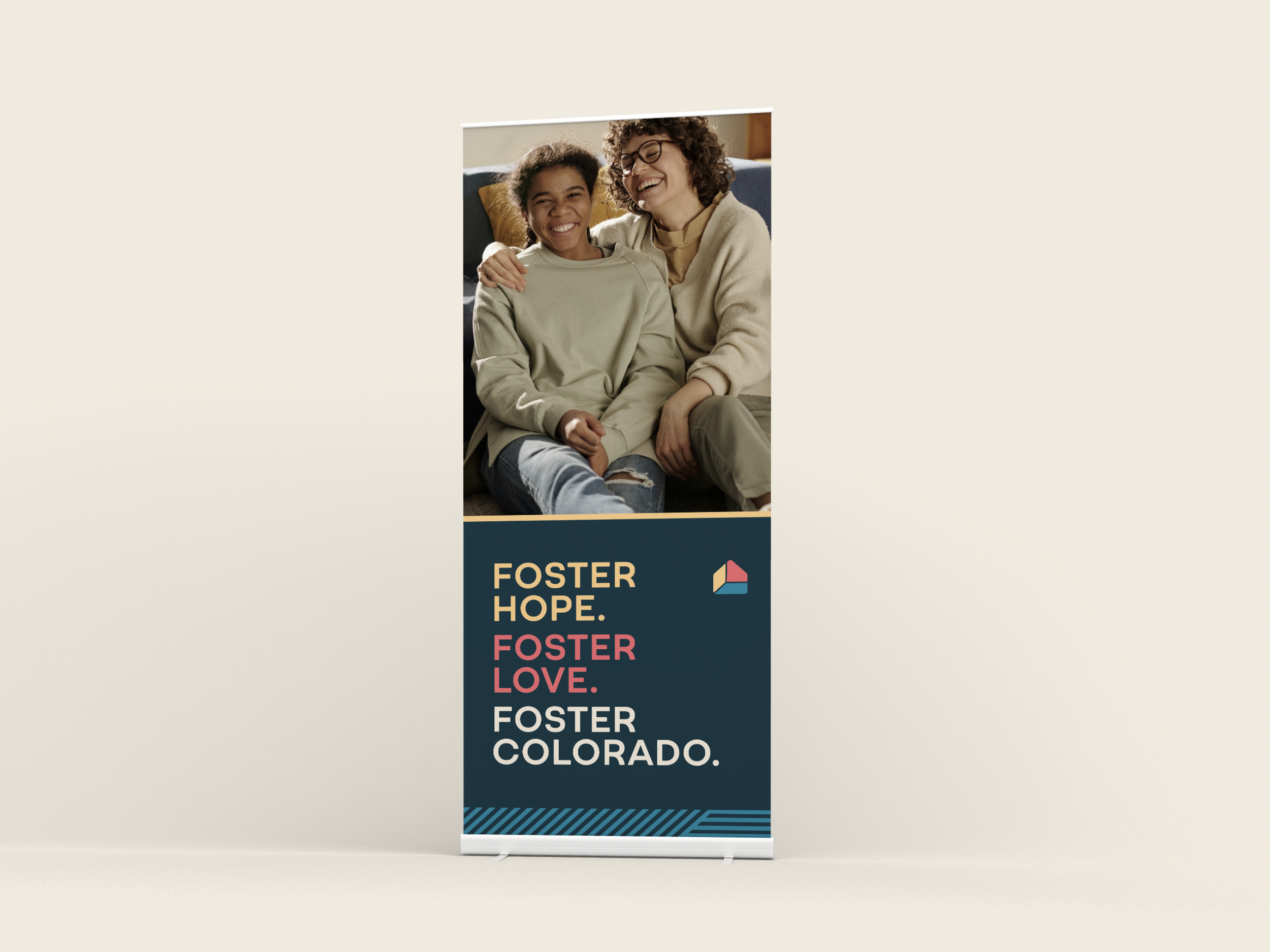
A brand identity for a tri-county foster care program, built to feel like the collaboration it's named for: grounded, approachable, and bigger than any one county working alone.
The Collaborative Foster Care Program serves Arapahoe, Douglas, and Jefferson counties under one unified system, connecting foster families, caseworkers, and community partners across a complex network of care. Full creative direction, strategy, design, and content development through Groundwrk.
-
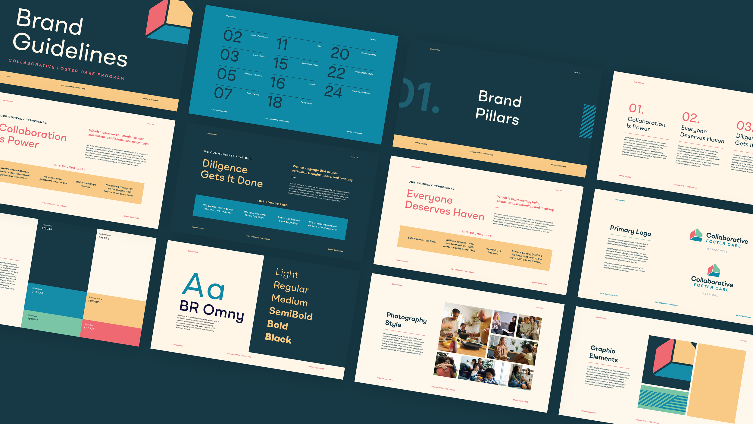
Foster care brands tend to pull in one of two directions: clinical and institutional, or overly soft and sentimental. Neither reflects what CFCP actually is, a serious, experienced organization doing community-level work that requires trust from multiple audiences at once, foster families, county caseworkers, and administrative partners. The brand needed to hold warmth and credibility simultaneously without defaulting to either extreme.
-
The logo draws directly from geography. The intersection of the three county lines becomes the mark itself, a simple geometric form that makes the collaboration literal without being heavy-handed. A palette of softened primary colors, mint, ocean blue, coral, sunshine yellow, brings energy and approachability while staying grounded enough for a professional context. BR Omny's rounded geometry carries the same balance: confident and friendly, modern without feeling cold. Graphic elements extend the county intersection motif into patterns and cropped silhouettes, giving the system flexibility across print, events, and OOH.
-
The brand gave CFCP a visual identity that finally matched the sophistication of the work they do, something that could speak credibly to county partners while still feeling welcoming to the families they serve.